An official website of the State of Georgia. ![]() Organizations
Organizations

Dashboard Help
Click the expandable options below to see more details on help topics
Water/Sewer Chart Help
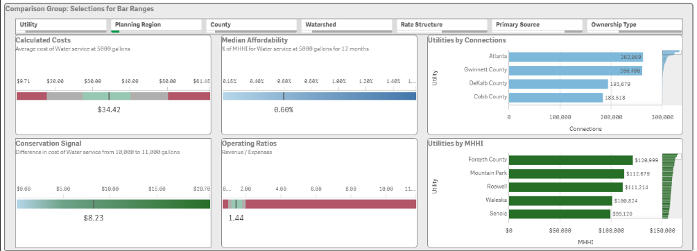
Calculated Cost
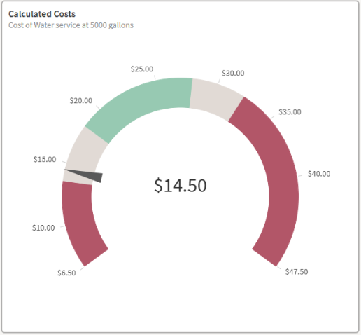
Displays the combined cost of Base Rate, Allowance Cost, and Consumption Rate for a selected Utility when on the Single Utility Comparison or Utility Focus dashboards, and when a single Utility is selected as a Primary Selection on the Expanded Comparison dashboard. Calculated cost will be an average of all Utilities when more than one is selected on the Expanded Comparison dashboard. If a Planning region, Watershed, etc. is selected the Calculated Cost will represent an average of all Utilities that are present in the Primary Selection.
* Selected service and consumption level are used to calculate all cost values
| Central Value |
|
| Ranges |
|
| Colors |
|
Median Affordability
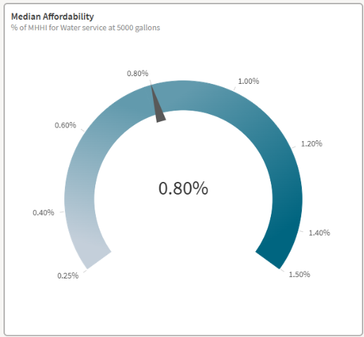
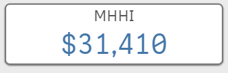
Displays the annual percent of median household income spent on the selected service when on the Single Utility Comparison dashboard and when a single Utility is selected as a Primary Selection on the Expanded Comparison dashboard. When multiple Utilities are selected on the Expanded Comparison dashboard, the Median Affordability is the median of all Utilities present in the Primary Selection. Median Household Income (Source: American Community Survey 2018-2022) is the median for the county in which the utility is primarily located.
* Selected service and consumption level are used to calculate all affordability values
| Central Value |
|
| Ranges |
|
Conservation Signal
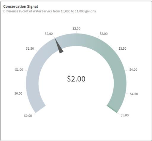
A Conservation Signal acts as an incentive to customers to prioritize conservation over consumption. This gauge displays the charge for an additional 1,000 gallons of consumption beyond 10,000 gallons a month for a selected Utility on the Single Utility Comparison sheet and when a single Utility is selected as a Primary Selection on the Expanded Comparison dashboard. When multiple Utilities are selected on the Expanded Comparison dashboard, the Conservation Signal is the average additional cost of all Utilities present in the Primary Selection.
* Selected service is used to calculate all conservation signals
| Central Value |
|
| Ranges |
|
Operating Ratio
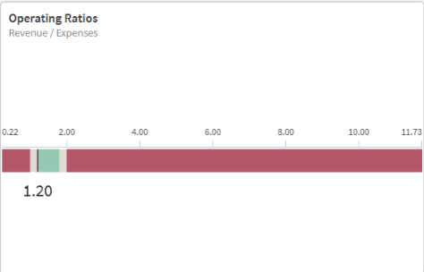

The Operating Ratio is an indicator of a Utility’s financial status. This gauge displays the reported revenue divided by expenses and depreciation for a selected Utility on the Single Utility Comparison sheet and when a single Utility is selected as a Primary Selection on the Expanded Comparison dashboard. When multiple Utilities are selected on the Expanded Comparison dashboard, the Operating Ratio is the average ratio of all Utilities present in the Primary Selection.
| Central Value |
|
| Ranges |
|
| Colors |
|
Stormwater Chart Help
Calculated Cost
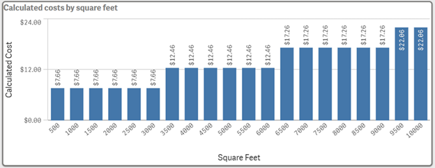
Displays the stormwater cost for the selected utility and customer type. If a base fee applies to the selected utility, it will be included in this chart.
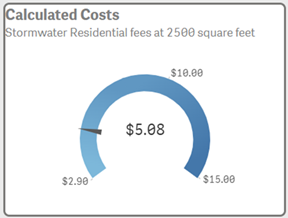
Shows how the selected utility’s stormwater cost compares to the comparison group. The minimum and maximum values appear at the ends of the gauge. The needle indicates the selected utility-- or the average of utilities-- position within this range.
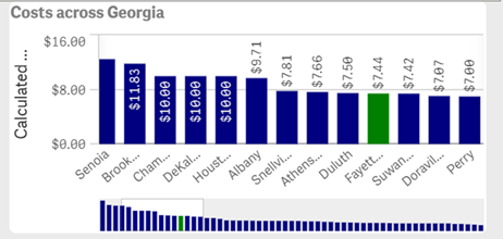
Displays utility costs across Georgia or within the selected comparison group. Use the mini‑slider at the bottom to scroll through the list of utilities.
Dashboard Basics
Click below to see more detailed information about using Qlik to visualize data.
Single Utility Comparison and Utility Focus
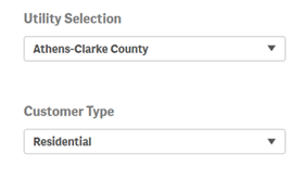
Single Selections allow for one selected utility and service/customer type to be applied to the entire sheet.
These examples work across both water/sewer and stormwater dashboards.
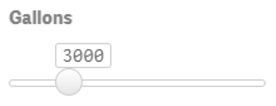
Sliders allow a single numerical value to be selected. The gallon slider on the water and sewer dashboards determine which consumption level is used for all calculated costs displayed on the sheet. The app will start with 5,000 gallons, but consumption levels from 0 to 15,000 gallons can be set using this slider.
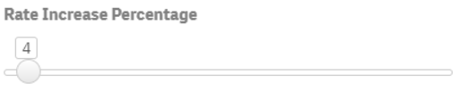
The rate or fee increase percentage slider is used to adjust calculated costs. The app will start with a zero value, but any value from 0 to 150 percent for water or 0 to 60 percent in 0.5 increments for stormwater can be set using this slider.
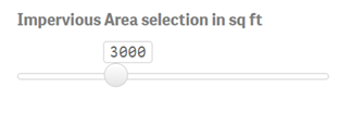
The Impervious Area slider (in square feet) allows you to adjust the desired impervious area when comparing a single utility. The app defaults to 3,000 sq ft, but you can select any value from 0 to 10,000 sq ft.
Key Performance Indicators (KPI) display information based on the single utility selection. KPIs labeled with “Average” display an average value from the selected utility’s planning region or all utilities statewide. Other KPIs display information for the selected utility. When no utility selection has been made, the native KPI state is to display a null value or a count, sum, or average of all utilities statewide.
Expanded Comparison
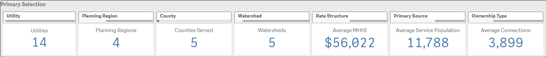
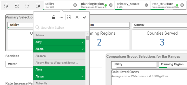
Primary Selection Filters are used to select desired metrics for primary calculations. These filters affect the primary selection of KPIs and measures within the comparison bars.
Users can select any number of items in the filter bars. The new filters can be confirmed using the check mark and will adjust the primary KPIs for each dashboard.
Primary KPI examples:

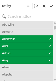
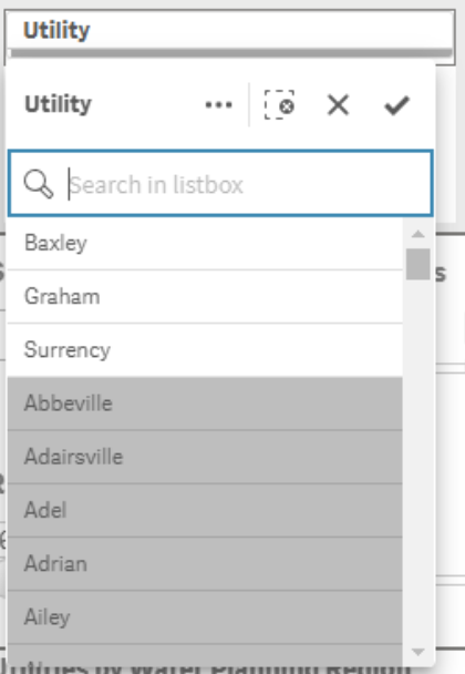
Users can also search for desired values (left).
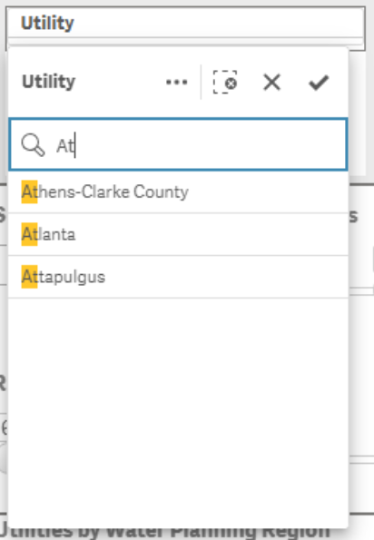
Selecting a filter value will affect the available options in other filters within the Primary Selection Bar. For example, with the Appling County filter applied, there are only three utilities available to select. Selecting one of these utilities would further limit the scope of information displayed on the page, and only information for the selected utility would be shown (right).
Users can clear filters by deselecting individual items from a variable’s drop-down menu or using a clear selection button. The clear selection button at the top of a variable’s drop-down menu clears all filters for that variable. The clear selection button at the top of the sheet clears filters for all variables.

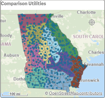
The Expanded Comparison Sheet allows for primary selection filters to be applied through the map. Users can select individual utilities and counties or select an area of utilities through the lasso and circle selection options.
Comparison Selection Filters on the Expanded Comparison sheet function similarly to the primary selection filters, but these selections are applied to the comparison charts for both water/sewer and stormwater.
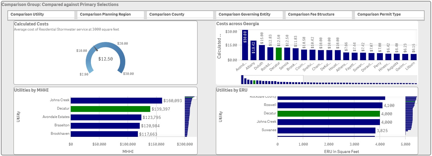
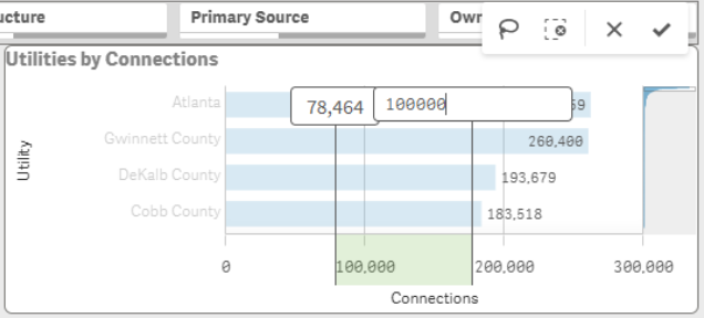
Comparison selections can also be made by filtering through bar charts. Users can select a range of values by dragging along the x axis. The bounds of these ranges can be edited through the value displays before they are confirmed.
Above, the initial selected range of connections was approximately 78,000 to 175,000, but the upper bound was changed by typing the desired value and hitting enter. The new comparison group is comprised of previously selected comparison utilities that have connection counts between 78,464 and 100,000. Axis selection is the only way to filter the comparison group by the number of connections or the median household income.
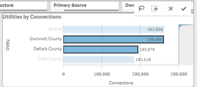
Users can also select utilities through the charts by clicking on the bars individually.
The Selection Bar is used to track all filters.
The step back button undoes previous filter changes. The step forward button reverses the step back button. The clear all selections button deletes all filters applied to the sheet. Each selection option operates in the same way as any filter selection elsewhere on the sheet making adjustments easier to manage.
Georgia Water Rates Webinar
Introduction - Judy Adler, GEFA Director of Water Resources
Current Rate Reports
Dashboard Help
Single Utility Comparison Dashboard
Utility Focus Dashboard
Expanded Comparison Dashboard
Stormwater Dashboard Tutorial Videos
Stormwater Utility Overview
Stormwater Utility Costs Dashboard
Stormwater Expanded Comparison Dashboard
Stormwater Data Tables