An official website of the State of Georgia. Organizations
Dashboards
This page lists some available dashboards for viewing reported information through the Georgia Environmental Finance Authority. Click a dashboard link below to see a focused view of data:
Water/Sewer Dashboards
 |
Utility Focus: View a display of key identifiers, statistics, and rate information for a selected utility. |
 |
Single Utility Comparison: Compare a selected utility’s metrics to the range of utilities in its planning region and statewide |
 |
|
Stormwater Dashboards
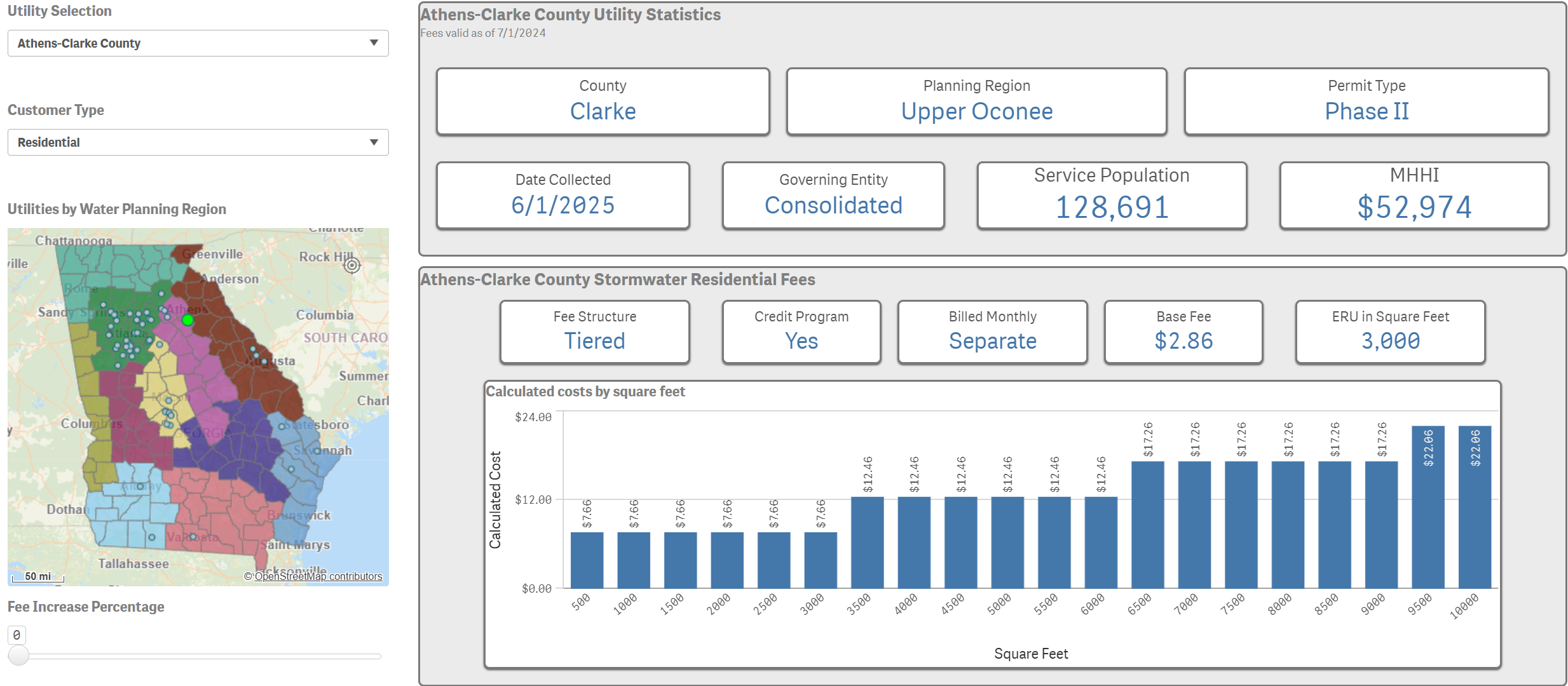 |
Stormwater Utility Overview by Sq ft: View a display of key identifiers, statistics, and fee information for a selected utility that uses square feet measurements. |
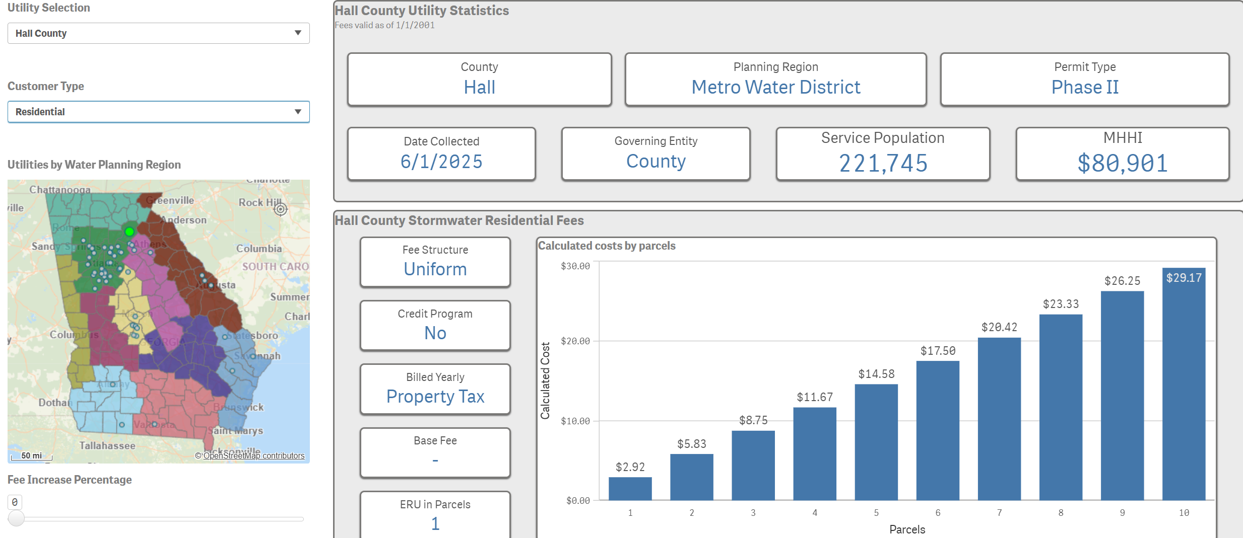 |
Stormwater Utility Overview By Parcels: View a display of key identifiers, statistics, and fee information for a selected utility that uses parcel measurements. |
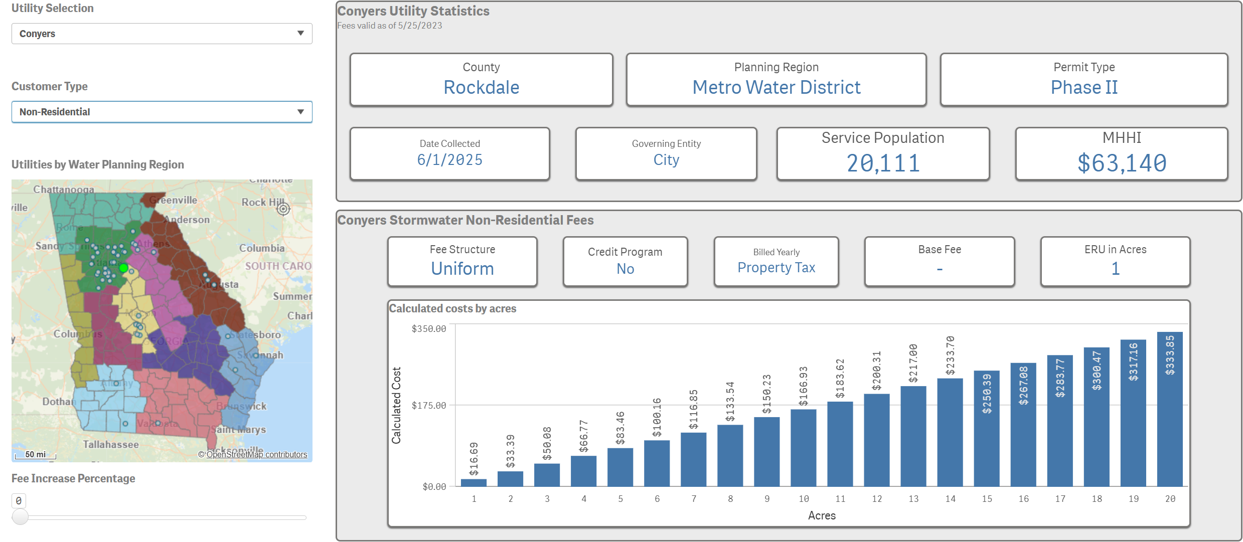 |
Stormwater Utility Overview by Acres: View a display of key identifiers, statistics, and fee information for a selected utility that uses acre measurements. |
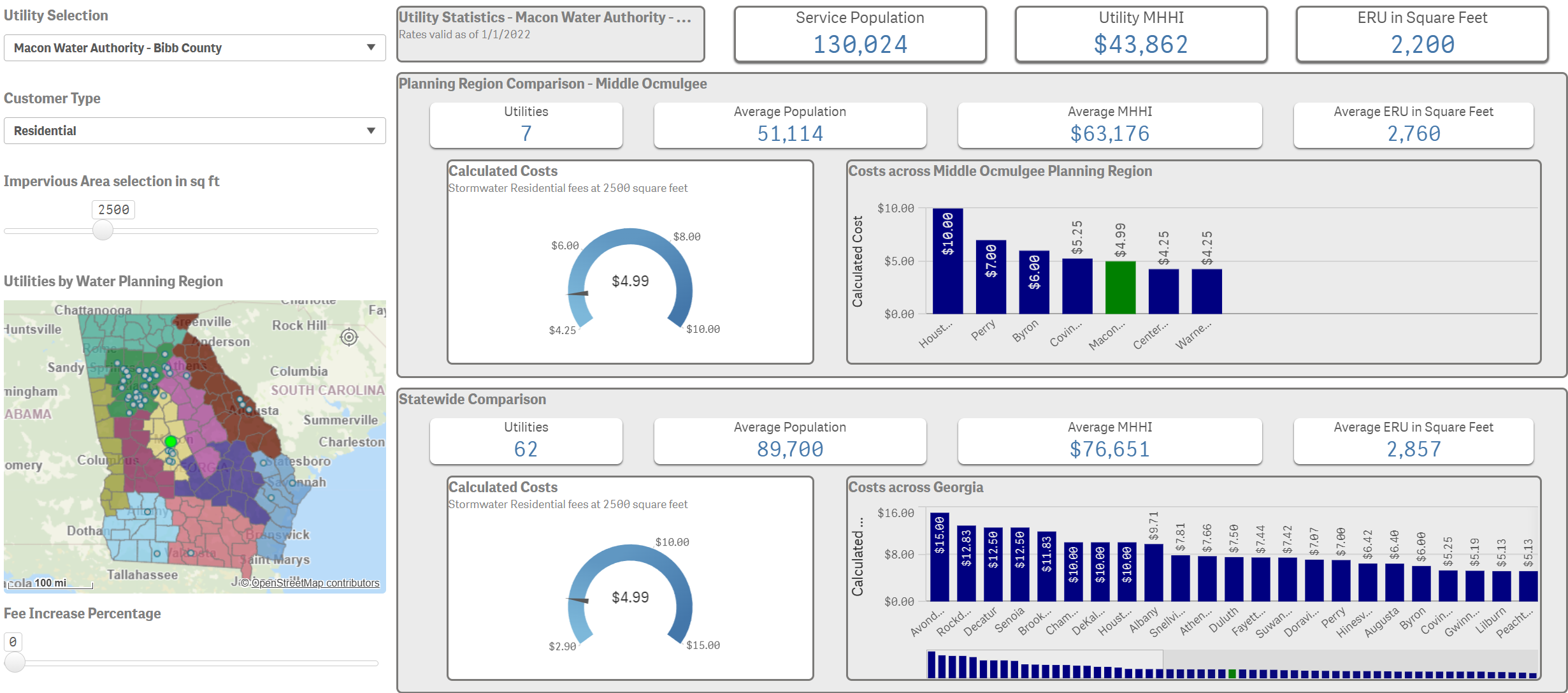 |
Stormwater Utility Costs (Sq ft): Compare a selected utility’s metrics to the range of utilities in its planning region and statewide. |
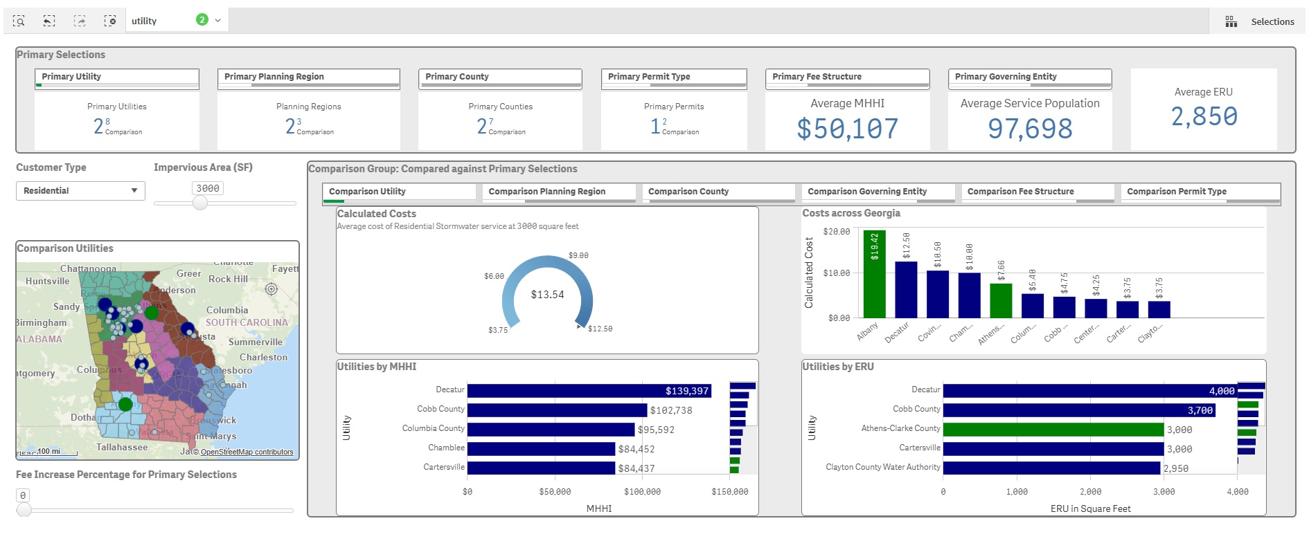 |
Stormwater Expanded Comparison (Sq ft): Compare a primary selection of filter options to a separate comparison group.
|
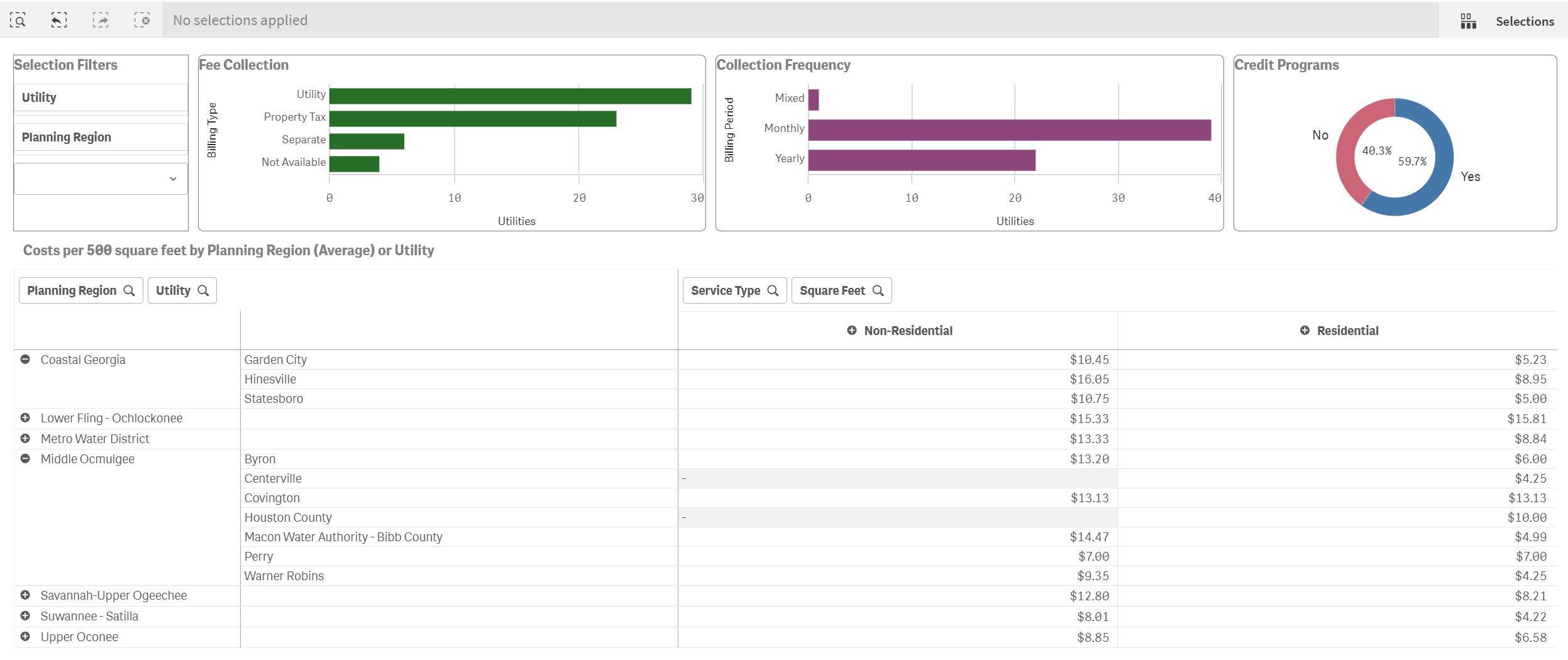 |
Stormwater Data Tables: View fee information for utilities using square feet in table format and charts for bill type, bill frequency, and existence of credit programs. Additional information about credit programs can be found within the specific utility rate report. |

